Color Theory and Renderings
In our Color Theory course during Semester 1, we were tasked with selecting a space that lacked visual appeal and functionality,
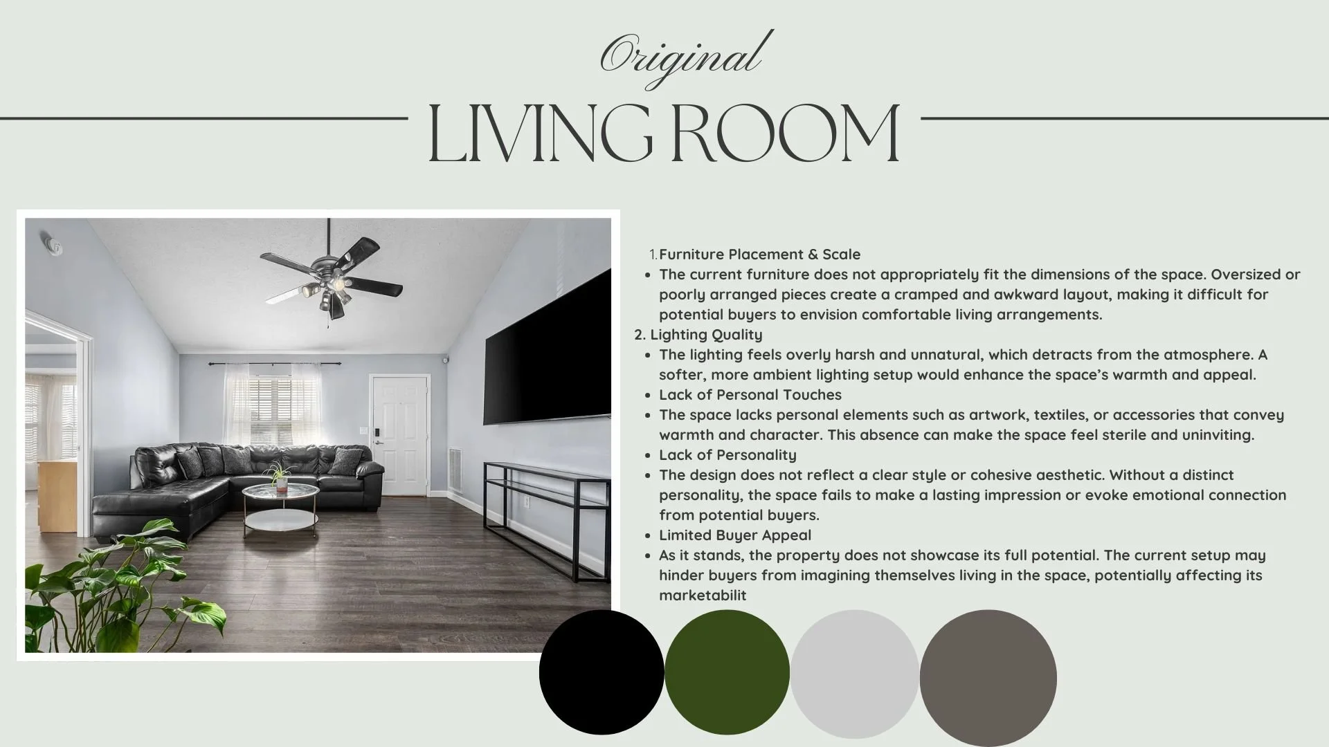
identifying its flaws, and redesigning it using the color theory principles and creative thinking we developed throughout the semester. I chose a dark, moody, and uninviting living room that felt cold, cluttered, and disconnected. The original design suffered from poor lighting, oversized furniture that didn’t fit the space, and a complete lack of personality or warmth—making it difficult for anyone to feel comfortable or emotionally connected to the room.
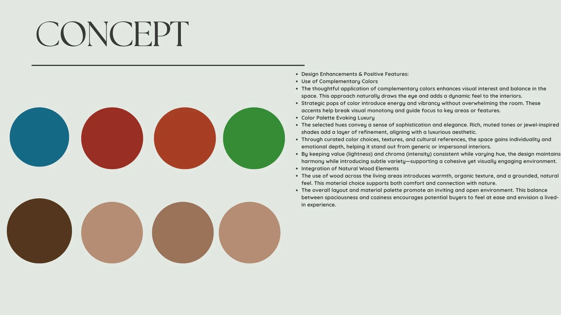
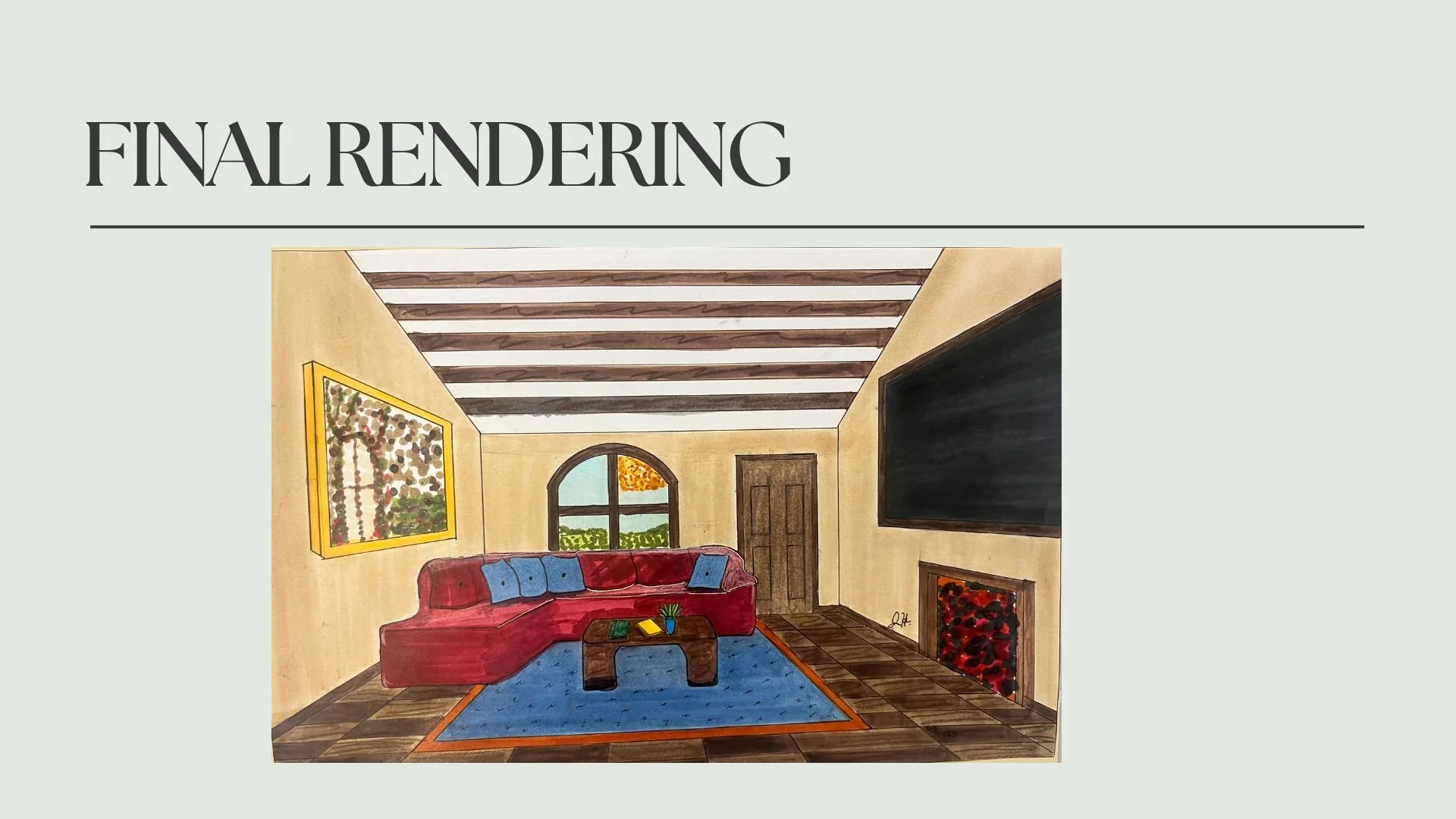
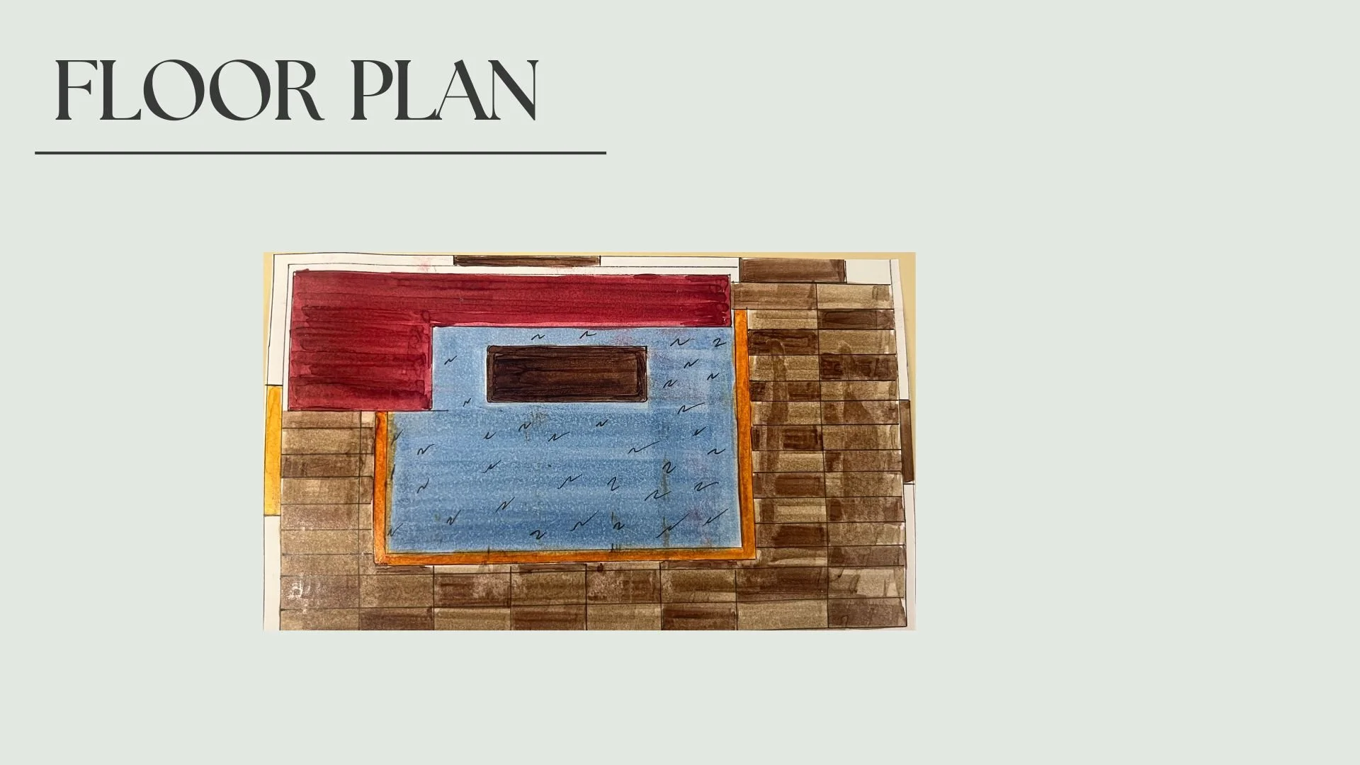
My goal was to transform the space into a warm, creative, and modern Italian-inspired living room. I used a color palette rooted in the warmth of Italian culture, incorporating earthy tones, sun-washed neutrals, and natural wood finishes to evoke a sense of hospitality and elegance. Complementary colors and intentional pops of contrast were used to bring visual interest and energy to the space, while maintaining a consistent value and chroma across different hues to preserve balance and harmony. I replaced the harsh, artificial lighting with softer, more ambient solutions to create a cozy and inviting atmosphere. Additionally, I introduced natural textures, culturally inspired elements, and strategic furniture placement to make the environment feel more open, livable, and emotionally resonant.
The final design not only reflects the principles of color theory but also transforms the living room into a vibrant, welcoming space that showcases personality and purpose—something the original lacked entirely.


